.png)

Mobile app design with an accessible focus.
The goal is to provide an approachable, accessible, and reliable way for people to navigate back to their starting point, even in areas without internet access
Role: UX/UI Designer
Scope: Research, information architecture, user flows, prototyping
Timeline: 4 Weeks
The idea came from simple, real situations like trying to remember where you parked in a large parking lot, or navigating unfamiliar outdoor spaces where everything looks the same.
The project focuses on creating a navigation experience that feels simple, reliable, and accessible. It is particularly relevant for hikers, travellers, as well as older adults or people with visual impairments who need extra clarity and confidence when moving through space.
Problem Statement 1: Accessibility and Visual Dependence
Current navigation tools like Google Maps or Komoot rely heavily on visual interfaces and constant screen interaction. In outdoor environments, glare, small text, and dense information make them difficult to use.
For users with visual impairments or age-related sight decline, this turns navigation into a frustrating and unreliable experience.
Problem Statement 2: Hands-Free Navigation for Active Users
For hikers and runners, navigation often requires switching between devices, checking a phone, listening to audio cues, or tracking progress on a smartwatch.
This constant interaction interrupts movement and focus, making the experience feel fragmented rather than seamless.
Problem Statement 3: Inclusivity in Outdoor Navigation
Most navigation tools are designed around standard modes like walking or driving, and rarely account for different mobility needs.
As a result, users such as wheelchair users may encounter incomplete or misleading route information, making outdoor navigation less accessible and less reliable.
Project Goals
ROAM is a mobile app designed to help users navigate outdoor environments hands-free and screen-free, using audio and haptic guidance. The app focuses on accessibility and safety for people with visual impairments, mobility limitations, or those who simply prefer minimal, distraction-free navigation during hikes, runs, or walks.
.png)
UX Research
Hypothesis
-
Older adults or individuals with mild visual challenges can become easily disoriented or anxious in unfamiliar environments.
-
Existing navigation apps rely heavily on maps and visual interfaces, which may not be accessible or intuitive for all users.
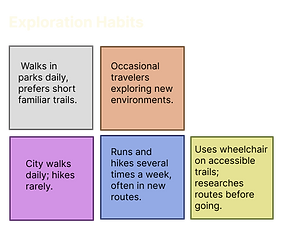
We Conducted User Interviews
In the initial round of user testing, I involved a diverse group of participants who represent ROAM’s core audiences: older relatives who may experience disorientation in unfamiliar environments; young travellers who frequently explore new areas and require offline navigation; and active hikers who regularly use outdoor trails.
User Interviews General Results
The results were fascinating. After the first two interviews, I recognized the need for an additional perspective, especially for an accessibility-focused app. I reached out to a wheelchair user to gain deeper insights.
Overall, the findings indicate that while many users adapt well to existing mapping or tracking apps, there is a significant appreciation for an app that prioritizes accessibility. Such a tool would not only support individuals who require accessibility features but also enhance the experience for all users.
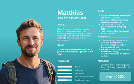
UX Research Affinity Map & Personas
My two main personas represent a broader range of users. By focusing on accessibility, they encompass the needs of people with physical disabilities, as well as those with limited digital literacy or short attention spans.
Photos created with AI
.png)
.png)
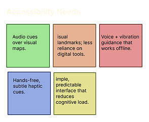
Affinity Map Key Insights
-
Users want reassurance they’re on the right track, not constant updates.
-
Solutions for visually impaired or mobility-limited users also benefit runners and casual walkers.
-
Battery life and signal reliability are universal barriers.
-
Visual distractions disrupts flow; subtle haptic or audio cues build trust.
-
Clear, single-step functionality empowers users with independence.
-
Exploration should focus on peace, focus, and freedom, not data or screens.


Information Architecture
Sitemap
The sitemap is designed for simplicity, with minimal information displayed on each screen. The goal is to enable hands-free navigation, and the structure is streamlined to a minimal number of screens.
.png)
User Flow
The user flow depicts all the possible paths the user can take to accomplish a task. In this scenario, Agatha searches for a wheelchair-friendly path to explore with a friend.
.png)
UI Design
Low-Fidelity Wireframes
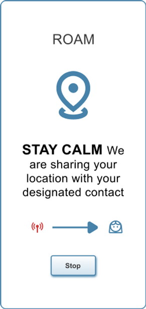
This sketch represents an early visual interpretation of what the app will look and feel like. The interface is centered around a single, large primary button, designed to be immediately noticeable and easy to interact with, paired with simple and clearly legible text that communicates its purpose without ambiguity. In addition to visual cues, the design incorporates audio instructions to guide the user through interactions, reducing reliance on the screen and allowing for a more accessible, intuitive, and distraction-free experience.
.png)
Mid-Fidelity Wireframes
Staying true to the principle of large, highly readable elements, uncluttered and straightforward screens, and a calm, cohesive colour palette, this design prioritizes clarity and ease of use at every step. Each screen is intentionally composed to reduce visual noise while maintaining focus and balance. The result of this approach is a set of mid-fidelity wireframes that clearly communicate structure, hierarchy, and user flow, while preserving the overall sense of simplicity and calm envisioned for the final product.
First sketch made with AI using the low-fi wireframe sketches

ROAM was tested by five users representing a diverse range of qualities and needs: a wheelchair user, a person with low vision, a fitness enthusiast, a frequent traveller, an older adult (over 80), a slow walker, a highly athletic individual, and an active hiker.
Overall, users found ROAM intuitive and calming, though there were a few areas that required clarification. For example, many participants weren’t completely sure what “Calibration” or “Accessibility Mode” did.
Low/Mid-Fidelity Testing Findings
-
Everyone immediately understood the large "Start" button.
-
A few testers didn’t understand the "Calibration" step.
-
The label “Accessibility Mode” was noticed but not explored; testers were unsure what changed when toggled on.
-
The “Select This Route” card was sometimes overlooked.
-
Most testers were uncertain regarding the commencement of "Return" mode, specifically whether it activates automatically upon selecting "Stop."
-
The function of the "Re-Start" button is confusing. (Some users assumed it would resume an existing route rather than initiate a new one.)
-
Users found the "Stay Calm" screen's tone and message to be reassuring.
-
Make "SOS" always visible as a floating, high-contrast button for easy access.
Findings
Mood Board
The vision is clear and deliberate: clean, simple, bold, and easy to use. It embraces a minimalistic aesthetic where every detail is intentional, and nothing is unnecessary. The experience is centered around a single screen designed to serve a single, focused purpose, allowing users to engage without distraction. Each element appears one at a time, guiding attention naturally and creating an interface that feels intuitive, calm, and effortlessly functional.


Brand Identity
ROAM's brand identity is built around accessibility, clarity, and purpose. Every design decision reflects a commitment to simplicity and functionality, ensuring that the product feels approachable and trustworthy. The interface seamlessly adapts between standard and accessible modes, while maintaining a consistent visual language and tone. Clean layouts, intentional interactions, and concise information define ROAM’s identity, reinforcing a brand that is focused, reliable, and designed to support users without unnecessary complexity.
.png)
.png)
.png)
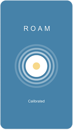
Logo Design
The logo depicts a minimalist breadcrumb-style path and a user icon, but its text is the most important element.
.png)
High-Fidelity Wireframes
This is the final version of the design, developed through careful iteration and refinement based on the feedback gathered during low–mid fidelity testing. Insights from this testing phase highlighted opportunities to improve usability and overall clarity, particularly in relation to accessibility.
As a result, the major changes were concentrated on strengthening the accessibility (“lite”) mode in comparison to the standard mode, ensuring it offers a more intuitive, supportive, and streamlined experience. These adjustments were guided by core principles of clarity, simplicity, and ease of use, allowing both modes to remain consistent with the brand, while better addressing the needs of a wider range of users.
.png)
Home Screen Standard mode - Lite mode
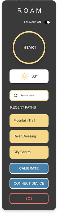.png)
.png)
SOS Screen Standard mode - Lite mode
.png)
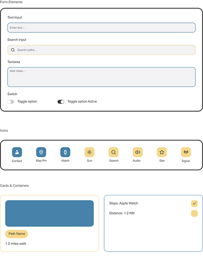
UI Kit

The ROAM UI Kit gathers all the elements, CTA type, forms, colours and provides guidelines for their implementation on the website. The kit is organized to highlight the distinctions between standard mode and lite mode, with element designed for both environments.
The ROAM UI Kit for both standard mode/lite mode: buttons, text fields, text guidelines, cards, colours, and logo.

High-Fidelity
Testing Plan
Test Overview
Objective: To evaluate whether users can effectively navigate and complete core actions within the ROAM app’s high-fidelity prototype, measuring efficiency, comprehension, accessibility, and emotional response.
Method: Moderated remote usability test (via Zoom or in-person). Participants interact with a clickable high-fidelity prototype.
Participants
Low-vision users who enjoy city walks and parks. A fitness enthusiast who uses a smartwatch and headphones during outdoor runs. A wheelchair user who enjoys accessible outdoor routes.
Test Goals
Determine if users can complete key navigation and safety tasks without confusion or assistance. Evaluate how intuitive and accessible the interface feels across different contexts. Identify areas where interaction or feedback needs improvement.
.png)


Iterations
The prototype was changed based on the feedback.
Many areas need to be improve.
-
SOS button accessible from all path screens.
-
Set a mileage and duration before a roam.
-
Change the UX copy the to accessible mode to Lite mode
.png)
.png)
High Fidelity
Testing Results
First testing results: Tasks were completed by all users, with a 88% success rate. Participants liked the app, and find it calming and beautiful.
.png)
Key Takeaways
Target Users
I really enjoyed this project. Although the UI is minimal, it was challenging to find the balance between bare and clean.
ROAM is a conscious, fresh approach to a project where one can create something appealing yet inclusive.
ROAM was designed to give users their freedom back. Offering calm, audio- and haptic-based navigation that helps them explore or just enjoy their walks hands-free.
The UX copy was really important for the users. It needed to be changed constantly until it was perfect. The copy conveyed exactly what users needed, in a way that was immediately clear.
.png)
Design Evolution
.png)
I developed the interface using a calm, muted colour palette and large touch targets. The visual design reflects the emotional tone users desired to enjoy walks with a sense of freedom, calm, and confidence.
My favourite part of the process was collaborating with AI to refine the design; balancing elements so the app would feel intuitive, unobtrusive, and emotionally reassuring.